10 questions · three of them in full depth
Every question,
and what came back.
Every one is a question somebody actually asks, answered from public data. Each has a plain-language version anyone can read, an interactive one you can operate, and the methods with every check that failed. Where the answer is partly no, that is written down as the answer.
Three carry their full method below, because a worked example says more than a summary — and in all three the figure that mattered came out of the evaluation rather than the model.
Every question, and the honest answer
Each one links to a plain-language version anyone can read, an interactive version you can operate, and the methods with every check that failed. Where an answer is partly no, that is the answer.
-
If you live there
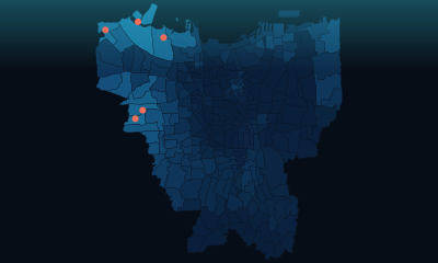
Everyone says Jakarta is sinking. Is your neighbourhood?
14 neighbourhoods are already below the line, and 803,014 people live in them. A quarter of the city is rising. Find yours on the map.
DEPLOYABLE WITH LIMITS · in daily operations
-
If you plan where buses and trains go
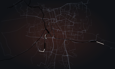
How much of the city can you reach from home in an hour?
3,440,880 people can reach almost no workplaces at all. The trains barely reach them: 89% of what rail adds lands inside Jakarta, which holds 30% of the region's people.
FEASIBILITY ONLY · in daily operations
-
If you decide where crews go
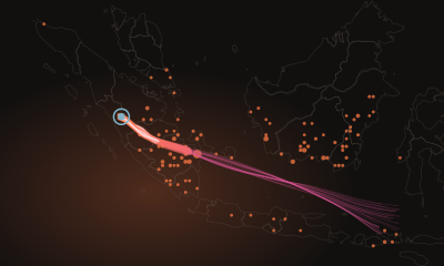
When the haze arrives, can anyone tell you who caused it?
Where fire is likely tomorrow, yes — better than the index in operational use today. Who lit it, no. The check that tried to answer that one failed.
DEPLOYABLE WITH LIMITS · in daily operations
Read the answer Dashboard How it was checked In full depth below
-
If you decide where aid goes
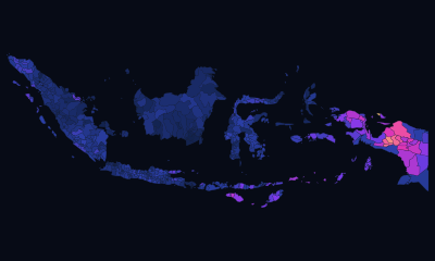
Can a satellite tell you which districts are poor?
Between provinces, yes. Within one, no — and the usual way of checking such a map makes it look nearly twice as accurate as it is.
FEASIBILITY ONLY · in daily operations
Read the answer Dashboard How it was checked In full depth below
-
If you buy, mill or store rice
Indonesia counts its rice harvest two months late. Can a satellite do better?
It can tell you when the harvest lands, weeks early. It cannot tell you how much: halve how often the satellite looks and 92% of the harvests disappear. The limit is how often it looks, not how finely it sees.
FEASIBILITY ONLY · in daily operations
Read the answer Dashboard How it was checked In full depth below
-
If you act on deforestation alerts
A clearing alert fired near a palm oil mill. Does that mean anything?
A little, and much less than the headline — in the provinces everyone names, almost nothing. Nearly half that forest sits near a mill before a tree comes down.
DEPLOYABLE WITH LIMITS · in daily operations
-
If you care about the night sky
Is your night getting brighter?
Almost everywhere, yes. This is the one question these satellites answer without standing in for something else — light pollution is what they measure.
FEASIBILITY ONLY · in daily operations
-
If you breathe Jakarta's air
Is the air where you live actually being measured?
Almost certainly not. Across the whole of greater Jakarta one instrument was still reporting, and it sent a fraction of the month.
BLOCKED BY INPUTS · in daily operations
-
If you plan an industry
What could Indonesia make next?
The shortlist is bananas and T-shirts. Of 400 candidate products, the ones within reach and worth learning number two.
FEASIBILITY ONLY · in daily operations
-
If you work on Indonesia's image abroad
Who in the world is actually paying attention to Indonesia?
Its neighbours, and very nearly nobody else.
UNPROVEN · in daily operations



Poverty mapping from space
The same model looks twice as accurate, depending only on how you test it
0.65, 0.58 or 0.40, on the three fold designs below — same model, same data, three ways of asking.
A LightGBM model predicting regency poverty rate from 31 features across five families — population (3), lights (6), buildings (11), landcover (9), geography (2) — built from night-time lights, building footprints, land cover and population. Nothing about the model changes between these three rows. Only the fold design does.
| Validation design | Folds | R² | What it answers |
|---|---|---|---|
| Random 10-fold | 10 | 0.653 | what a default cross_val_score reports |
| 200 km spatial blocks | 108 | 0.577 | neighbours can no longer be in both halves |
| Leave-one-province-out | 38 | 0.395 | predicting a province the model has never seen — the honest number |
Choosing the first row would have been defensible, conventional, and wrong by 0.26 of R². Neighbouring regencies are similar, so a random fold leaves the answer next door; blocking at 200 km removes some of that, and holding out a whole province removes it properly. 0.395 is the number a reader gets.
Where the remaining skill actually comes from
Reporting the honest R² is not the same as understanding it, so the case decomposes it — and the answer is uncomfortable.
- 57% of the squared error is a single constant per province. The model is substantially recovering each province's own offset rather than seeing poverty.
- Within a province, R² is 0.077. Rank a province's own regencies against each other and the model is close to blind — which is exactly the comparison a targeting decision would need.
- On cities, R² is -0.599 against 0.365 on rural regencies. Worse than predicting the mean. A single national figure hides that completely.
- A naive temporal split reports 0.946. Removing the leakage takes the same model to 0.332. Both numbers are published, because the first one is the one most write-ups would print.
- Ridge on the same features and the same folds: 0.185. The gradient boosting is earning its complexity — which is worth checking rather than assuming.
What this demonstrates. Knowing that a validation design is a modelling decision, that a spatial target leaks through geography, and that a headline metric can be almost entirely composed of structure the model was handed rather than signal it found.
Open the dashboard In plain language Method and validation model.py review.py
Java's rice harvest, from radar
Right where it fires, blind to most of the crop — and an experiment showing why
It agrees with an independent rice map 90% of the time on the cells it flags, and finds 39% of the fields that map calls rice.
1,247 Sentinel-1 scenes over 6 of Java's largest rice regencies, 2022-07-07 to 2026-08-25, reduced to per-cell backscatter time series — 231,278 cells × 189 acquisitions in Bojonegoro alone, a median of 252 observations per cell. C-band radar because it sees through monsoon cloud, which optical cannot.
The detector agrees with an independent rice map 90% of the time on the cells it flags, and finds 39% of the cells that map calls rice. Precision is the one statistic a detector can always buy by finding fewer fields, so the interesting question is what limits recall. The published explanation was cell size. It is not.
The experiment: same fields, same detector, fewer looks
Karawang, 96,603 known rice cells, 4 seasons. Acquisitions are removed from the record and the unchanged detector re-runs. Soil, variety, weather, thresholds and code are all held constant — only the revisit interval moves.
| Median gap | Acquisitions | Crop cycles found | vs full record | Extent recall |
|---|---|---|---|---|
| 6 days | 225 | 284,388 | 100% | 72% |
| 12 days | 113 | 22,635 | 8% | 20% |
| 18 days | 75 | 1,511 | 1% | 2% |
| 24 days | 57 | 233 | 0% | 0% |
Doubling the revisit interval from 6 to 12 days costs 92% of the crop cycles. The binding constraint is how often the satellite looks, not how finely it resolves — and across regencies the correlation between revisit gap and extent recall is -0.49.
What it is actually good for
- The date, not the hectares. Monthly area correlates with the official series at 0.11 — near nothing. Allow a 1-month systematic lag and the same series correlates at 0.77. The instrument recovers when the harvest lands, which is the more useful product, and not the quantity it was built to estimate.
- Calibration, scored on a hold-out rather than in-sample. Uncalibrated monthly R² -0.80 → in-sample 0.07 → hold-out 0.22. Reporting only the middle number is the usual way this gets published.
- The benchmark was checked before it was trusted. The official survey changed method in 2018, a -19.4% step — four years before this record opens on 2022-07-01, so it cannot explain the shortfall. Ruling that out mattered more than any model change.
What this demonstrates. Satellite ingest and reduction at volume; designing a controlled experiment on a pipeline you already built; and being willing to conclude that the product is a different quantity than the one you set out to measure.
Open the dashboard In plain language Method and validation ingest_sar.py audit.py
Fire and haze early warning
Better than the index fire services use today, one day ahead
Given one square that burned and one that did not, it puts them in the right order 88% of the time against the operational index's 79%, on the same rows.
Day-ahead fire risk over 1,955 cells, trained on 31,330,515 rows of weather and fire history across 15 years. The positive class is 3.8% of rows, so the model is scored on ranking rather than accuracy, and negatives are subsampled at 0.06 with 400 boosting rounds.
| Horizon | Rows scored | AUC |
|---|---|---|
| 1 day ahead | 2,142,680 | 0.875 |
| 3 days ahead | 2,142,680 | 0.848 |
| 7 days ahead | 2,142,680 | 0.822 |
- The rival is an operational index, not nothing. On the same 266,658 rows, the Fire Weather Index scores 0.791 and this model 0.881. Beating a real incumbent is the only comparison that means anything; beating a constant is not a result.
- Held out on the years that matter. 2015 and 2019 — the two catastrophic haze seasons — are excluded from training entirely and scored as anchors: AUC 0.909 and 0.904. A model that only works in ordinary years is useless for the purpose.
- Blocked in space and in season. 4 spatial folds over 73 blocks of 2°, plus season-held-out folds, because fire is autocorrelated in both dimensions and a random split would flatter it in both.
- Attribution that admits when it cannot attribute. A back-trajectory ensemble over 287,820 parcels and 9,594 receptor-days names a likely source province for smoke — and reports that 8% of receptor-days have no attributable source at all. The naming is stable for 89% of episodes when the trajectory is truncated at 48 hours, and agrees with observed bearing within 30° for 61% of them.
What this demonstrates. Imbalanced ranking problems scored the way they should be, a baseline that is a real operational system, hold-out chosen for consequence rather than convenience, and a downstream attribution step that publishes its own failure rate.
Open the dashboard In plain language Method and validation risk.py transport.py
Found something wrong on this page? Report a correction — it opens a pre-filled issue — or email taufik.adi@openstudy.id. Corrections are credited by name in the errata, and one that changes a finding says so on the page.