16 public data sources · Indonesia · 10 questions answered · the code is public
Hard questions about Indonesia, answered from public data —
including the ones the data cannot answer.
Is my neighbourhood sinking? Where will tomorrow's smoke come from? When does the rice come in? People and governments ask these questions, and the data to answer them has usually already been published. It was published to do a different job — a statistical yearbook, a satellite archive, a compliance record — so answering a decision with it means joining 16 sources that were never designed to meet, and then testing the result until something breaks. That is the part I do.
Ten are answered here. Each one says plainly what it is good for and what it must not be used for — because the second half is what makes the first half safe to act on.
- 42 checks written before the analysis ran, thresholds set so a result could fail. 19 failed. All 19 are published, next to the finding they qualify. See them
- Reproduces a published measurement to 0.032 cm/yr, and agrees with independent ground stations. Jakarta, against Ohenhen et al. (2026)
- Contradicts a published finding — 0.833 where the paper reports 0.01 — and identifies the cause rather than claiming the win. Night lights, against Gibson et al. (2021)
- Every figure is read from the record its pipeline wrote, never typed, so a chart and a sentence cannot disagree. The code is public
- The judgement calls are written down too, with the errors that had to be corrected in public. Decisions and corrections
Four questions worth asking, and what came back
Two of these answers are partly no — said here rather than buried, because a client who is told what work cannot do can trust what it can.
-
If you live there
Everyone says Jakarta is sinking. Is your neighbourhood?
14 neighbourhoods are already below the line, and 803,014 people live in them. A quarter of the city is rising. Find yours on the map.
Jakarta Is Sinking
-
If you plan where buses and trains go
How much of the city can you reach from home in an hour?
3,440,880 people can reach almost no workplaces at all. The trains barely reach them: 89% of what rail adds lands inside Jakarta, which holds 30% of the region's people.
The Hour
-
If you decide where crews go
When the haze arrives, can anyone tell you who caused it?
Where fire is likely tomorrow, yes — better than the index in operational use today. Who lit it, no. The check that tried to answer that one failed.
Fire & Haze Early Warning
-
If you decide where aid goes
Can a satellite tell you which districts are poor?
Between provinces, yes. Within one, no — and the usual way of checking such a map makes it look nearly twice as accurate as it is.
Poverty Mapping from Space
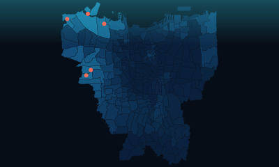

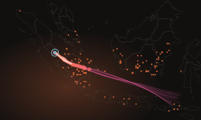
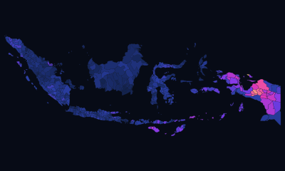
Each of these has three ways in, all built from the same record — an interactive dashboard to explore, a plain-language write-up anyone can read, and a technical one with the methods and every check that failed. None can drift from the others: the numbers in all three are imported, not typed.
Six more questions, answered the same way
- Indonesia counts its rice harvest two months late. Can a satellite do better? If you buy, mill or store rice
- A clearing alert fired near a palm oil mill. Does that mean anything? If you act on deforestation alerts
- Is your night getting brighter? If you care about the night sky
- Is the air where you live actually being measured? If you breathe Jakarta's air
- What could Indonesia make next? If you plan an industry
- Who in the world is actually paying attention to Indonesia? If you work on Indonesia's image abroad



All 10 questions, with the answers How a result gets to count
Where the data said something nobody expected
Across the 10 cases, 42 checks were written down before the analysis ran. 19 of them failed, 4 are unresolved, and every one is published. Below are seven of those results, chosen because each changed what its answer could honestly be used for.
| What came back | Which question |
|---|---|
| A map of sinking ground that does not say where it floods. Of the 14 neighbourhoods already below the line, 6 have ever flooded — and not one is among the worst-flooded parts of the city | Everyone says Jakarta is sinking. Is your neighbourhood? |
| A rail network whose benefit skips the people furthest out. Of everything the trains add to what people can reach, 89% lands inside Jakarta, which holds 30% of the region's people. Of that gain, 80% goes to the tenth of places that could already reach the most | How much of the city can you reach from home in an hour? |
| A smoke-tracking model that refuses to answer rather than guess. On 8% of smoky days it cannot name a source at all — and when it can, it agrees with the direction the smoke actually came from less often than the target required | When the haze arrives, can anyone tell you who caused it? |
| Over half the map's error was one fixed offset per province. A satellite cannot see the poverty line the roofs are judged against, so checking the map the usual way makes it look nearly twice as accurate as it is | Can a satellite tell you which districts are poor? |
| Accuracy bought by finding less. A detector offered 83% agreement as proof it had found the rice — but that figure always improves when a detector finds fewer fields | Indonesia counts its rice harvest two months late. Can a satellite do better? |
| A forecast 41% worse than guessing. Nearly everything it produced was a fixed number that would print almost unchanged if the satellite were switched off | Is your night getting brighter? |
| The archive now holds a quarter of the articles it held nine years ago. Counting raw mentions would have told a confident and completely false story about what the world pays attention to | Who in the world is actually paying attention to Indonesia? |
How each of these was caughtfor the technically minded
- Everyone says Jakarta is sinking. Is your neighbourhood?
- Pre-registered gate G-C5: exposure ranking against observed flood events, compared against an equal-length list of the worst-flooded neighbourhoods, ρ 0.164 against a 0.5 threshold. Failed, and published as failed.
- How much of the city can you reach from home in an hour?
- Measured as incidence, not as an average: the gain is decomposed by where it lands. Rail moves the spread of access by 0.0061, the whole bus and minibus system by 0.1134. Note this is about distribution, not geography — Jakarta captures a larger share of the bus gain than of the rail gain, and both are Jakarta systems.
- When the haze arrives, can anyone tell you who caused it?
- Two of five pre-registered gates failed, both in the attribution half: bearing agreement within 30° on 61% of 9,594 receptor days against a 70% target, and 8.1% of days unattributable. The fire-risk half passed, which is why the warning is trustworthy and the accusation is not.
- Can a satellite tell you which districts are poor?
- Only a spatially-blocked fold design exposes it: a random 10-fold reports R² 0.65 where blocked folds report 0.395, and 57% of the squared error is that per-province offset. The inflation was the finding.
- Indonesia counts its rice harvest two months late. Can a satellite do better?
- Caught in adversarial review of our own published claim — precision rises as recall falls — which was then corrected on the page.
- Is your night getting brighter?
- Requires scoring against a naive rival; 99.5% of the fit was intercept. Without a rival it looks like skill.
- Who in the world is actually paying attention to Indonesia?
- Found by checking the denominator, which nothing in the data announces.
Everything here can be checked
Every figure on every page is read from a record a pipeline wrote, not typed in by hand — so a number on a chart and the same number in a sentence cannot drift apart. The data comes from 16 public sources, and none of it arrives in a usable shape.
/stack/ lists every tool with its version and a link to the file that uses it, generated from the repository rather than typed, so it cannot name a library the code does not install. /standards/ is the rule a result has to pass before it appears here at all.
The stack, in full How a result gets to count The repository
What I need, and what I can build
If you know the subject
I am not a hydrologist, an agronomist or an epidemiologist. That is exactly why nothing here rests on my judgement: every finding is gated by checks written down before the analysis ran, and every page states what its answer must not be used for.
Measurement is finished on all ten; what none of them carries is what the result means in its own field. That needs someone who knows the subject, and it is a small ask: read the finding, tell me whether it is plausible, and say so in your own words if you want the credit. If your reading is that it should not be published, that ends it.
If you have the research and not the tools
Most of the people this would help are strong in their own field and have never had to open a NASA endpoint, fit a gradient booster or build something interactive — the work sits in Excel or SPSS because that is what was available. That gap is the thing I am useful for, and it costs nothing. The findings stay yours.
Found something wrong on this page? Report a correction — it opens a pre-filled issue — or email taufik.adi@openstudy.id. Corrections are credited by name in the errata, and one that changes a finding says so on the page.